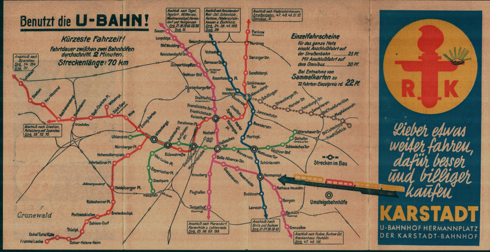
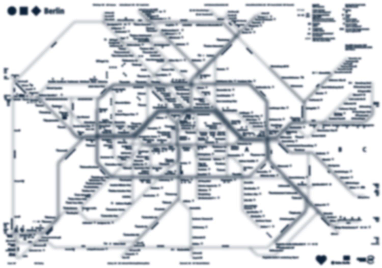
The previous transit map was designed almost 30 years ago. Since that time, quite a lot of stations have appeared, and the map has got out of style and become too complicated. Nearly three million people a day use Berlin urban rail and underground, one can’t just put a blind eye on it. It is obvious that the map needs updating.
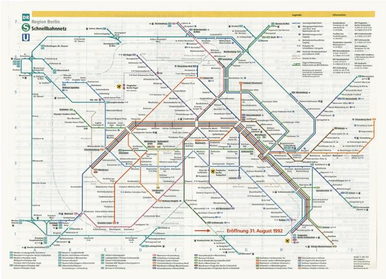
1992
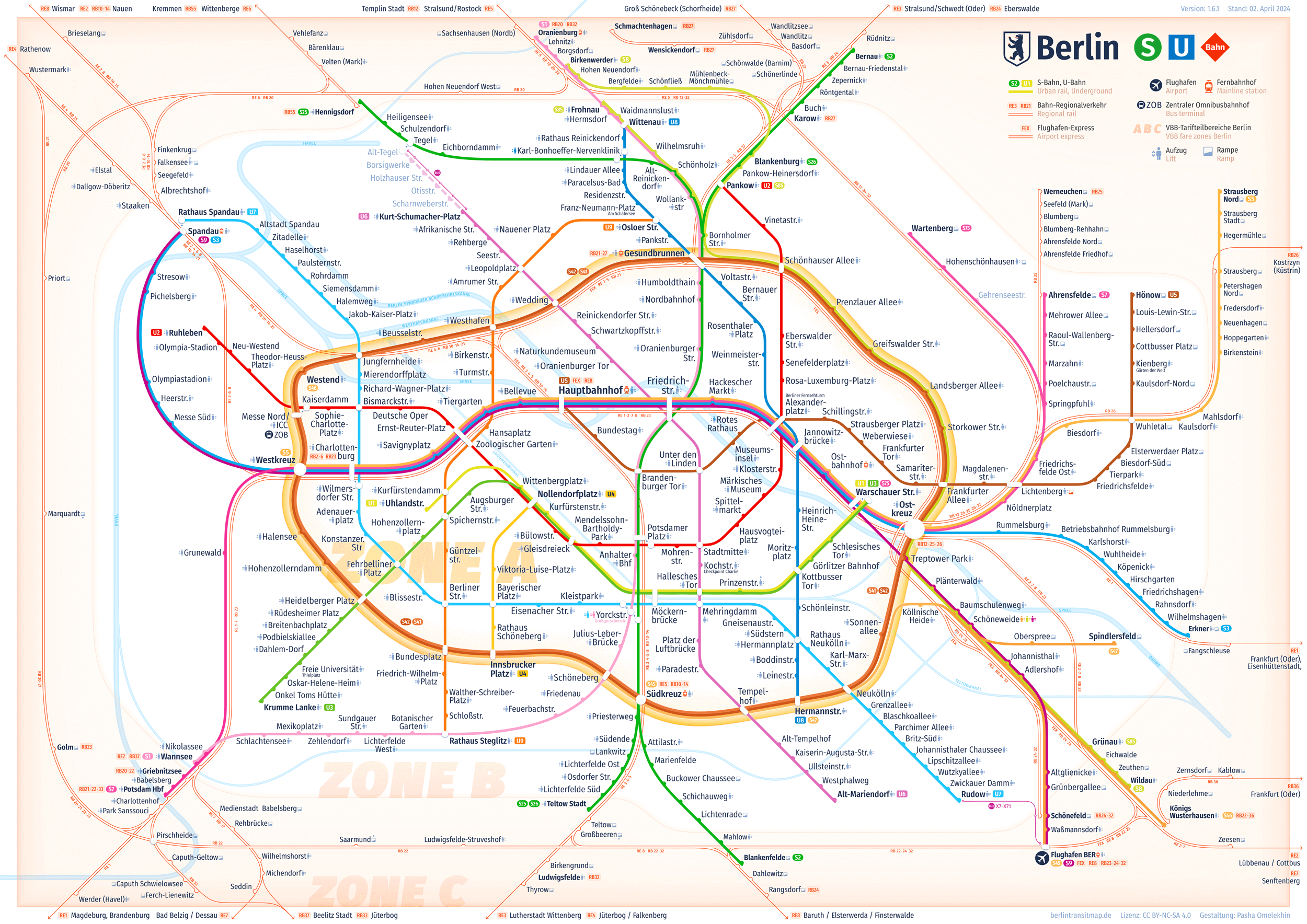
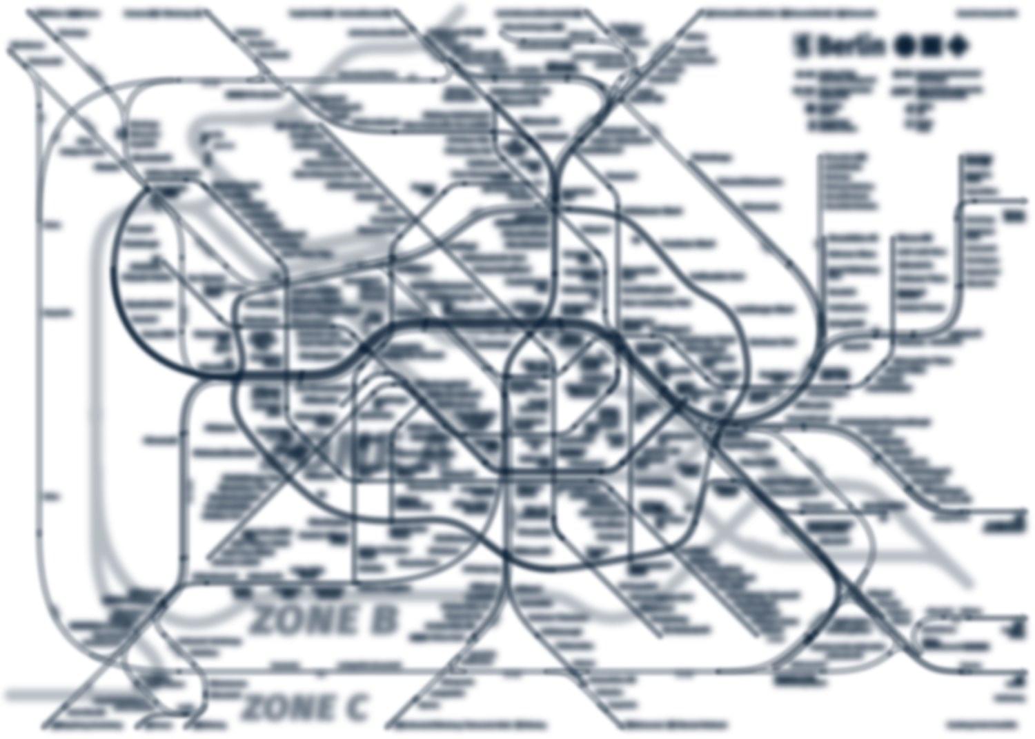
2021

The new map has been designed from scratch within two years. Not only allows it to navigate quicker and build a route, but it also does delight passengers’ eyes.
New Geometry of Lines
The lines are drawn in a way that allows to find the required station and build a route as easy as possible. Owing to large rounded angles and small quantity of turns, eyes can easier monitor the route.

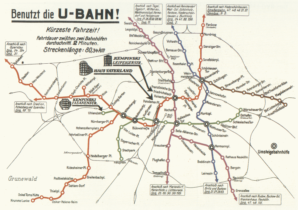
The previous map looked too robotized. Too many turns made it very hard to read. It was quite an ordeal to draw a route.

Assess how simpler the lines look now.

The map lines are very orderly. Most of them are in axial alignment or spaced at regular intervals or scatter symmetrically.
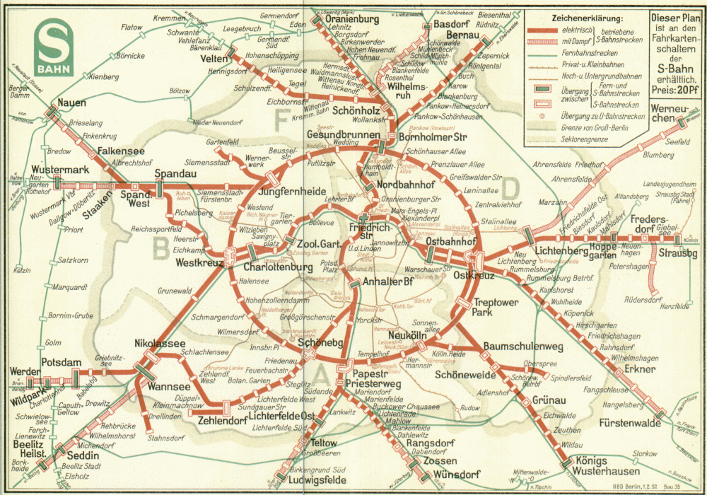
The commuter rails have also become simpler: less turns, and junctions look more illustrative.

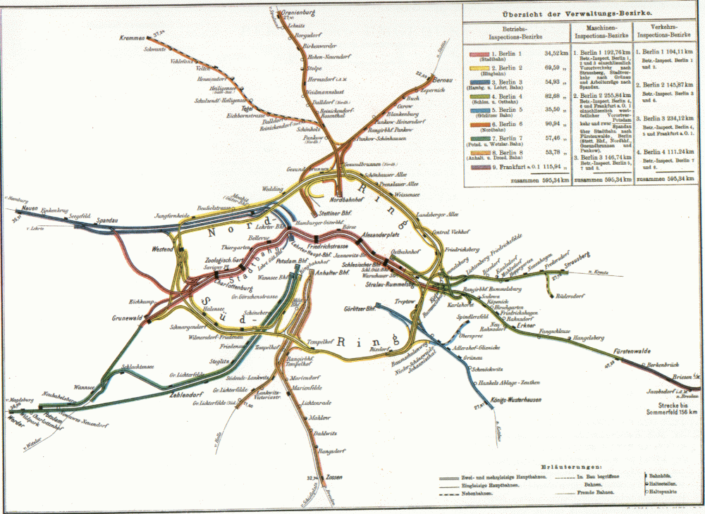
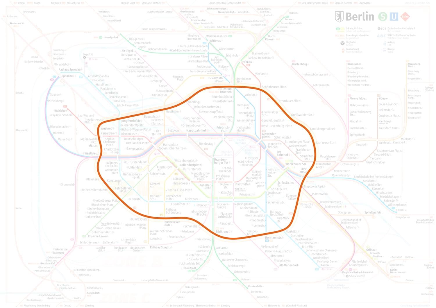
New Circular Line (Ringbahn)
Berlin has a unique feature: the Ringbahn is the shape of a dog’s

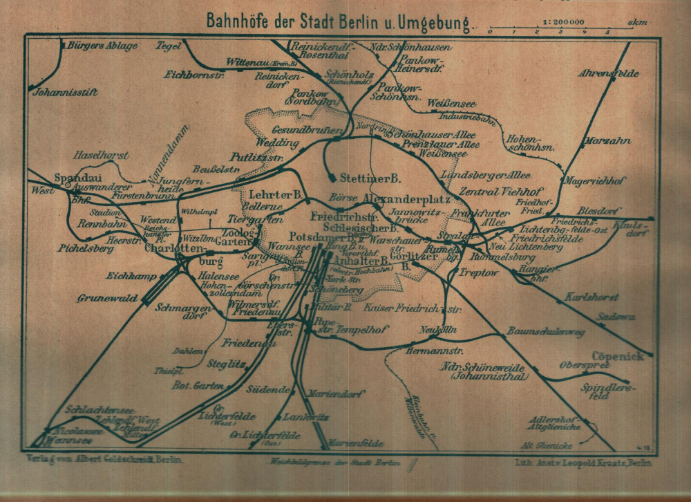
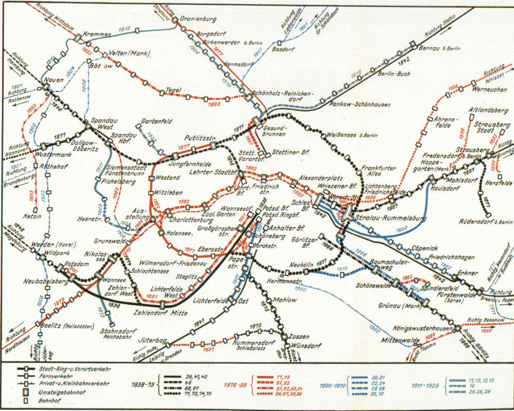
From 1896 to 1931, the map showed the circular line exactly like this. Given the different line patterns, you can’t call them just geographic maps.
1896
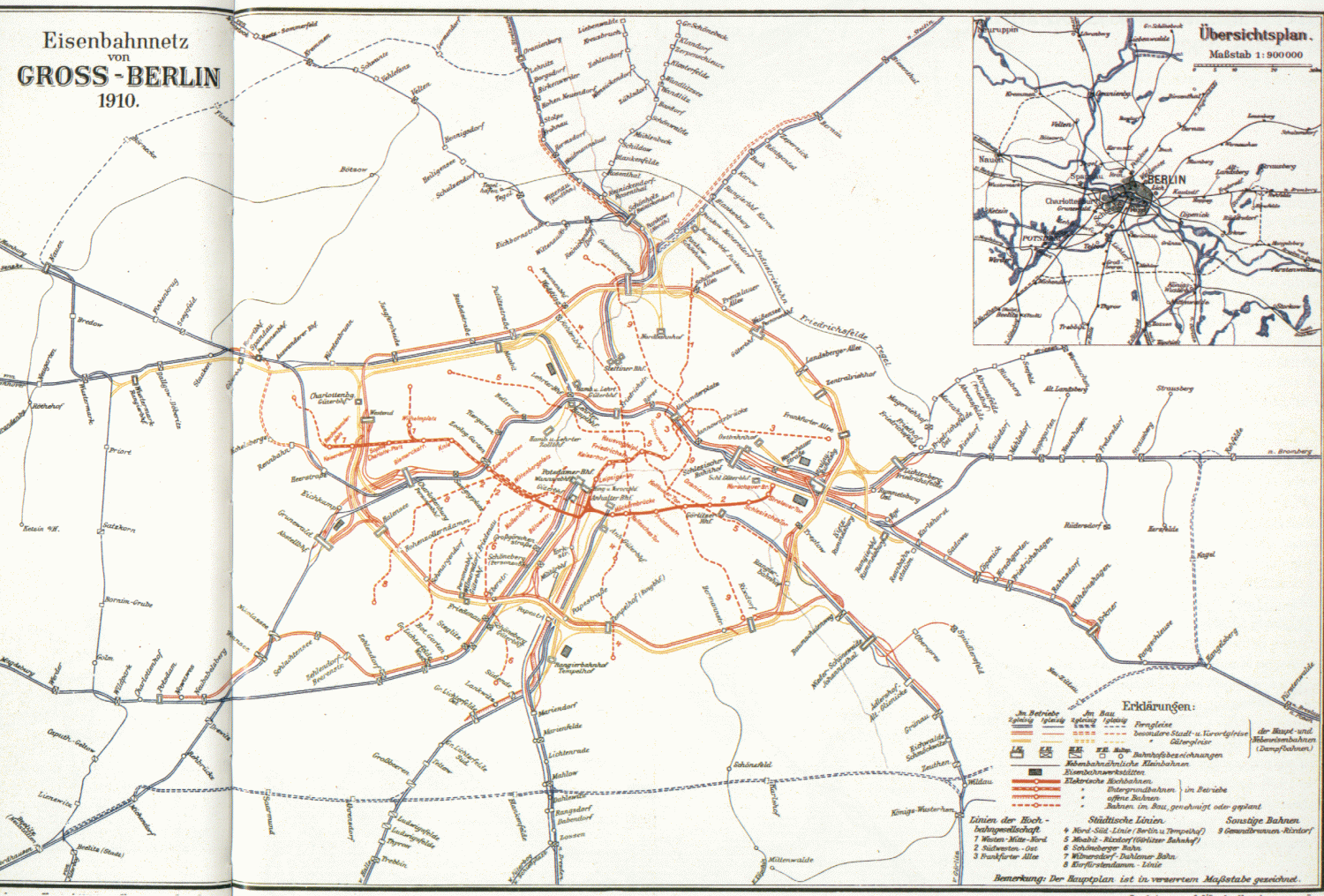
1910
1918
1923

1930
1930
1931
In 1931, this nice trait was gone.
1931

1934

1951
Now the circular line has reverted to its historical and unique appearance.
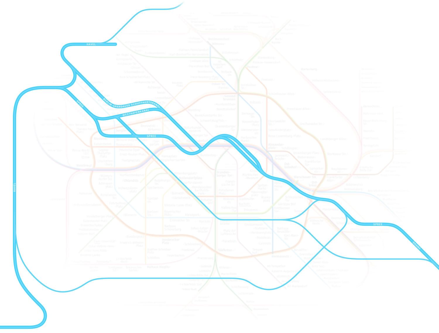
Rivers and Channels
The rivers and channels serve as excellent city landmarks: with them in place, it is easier to recollect and correlate station marks in the map with their city locations. This is the reason for displaying them.
Contrasting Colours
Statistically, about
Protanopia
Deuteranopia

Uniformity
The more even the information distribution is, the better the map looks. The situation when one location is overpopulated and the other one is abandoned is not really good. This problem was obvious with the previous map.
The distribution of the elements in the new map is even across the entire sheet.
Scaled-Up Font Size
The bigger font size is the easier it is for you to read it, especially for people with poor eyesight. The font size in the new map has become bigger and is increasing from periphery to the centre. In

Attention to Details
The map has to be good not only integrally, but in details also, as a German car. Unfortunately, it is not the case with the previous map:
- Rounded corners have various radii,
- Stations and switch stops are shown with marks of different lengths,
- The same elements located in different map parts are placed at different distances from each other,
- The circular line’s opposite faces have different lengths.
Where has the famous Made in Germany quality gone?
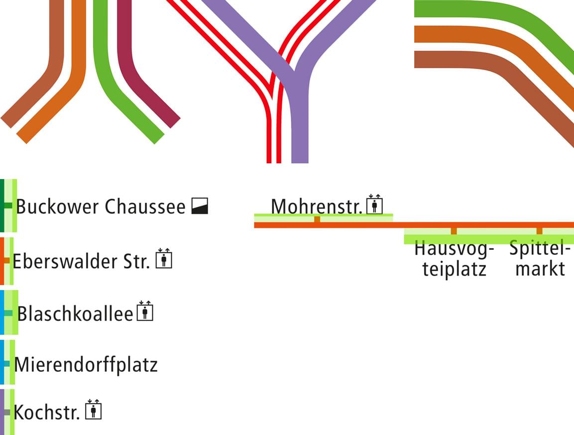
The new map is a reference standard and a role model. All the elements are placed with pinpoint accuracy; the angles have smooth rounding of the equal radius, and station names stand at equal distance from the marks. The map accuracy is like Swiss clockwork.

Systemization
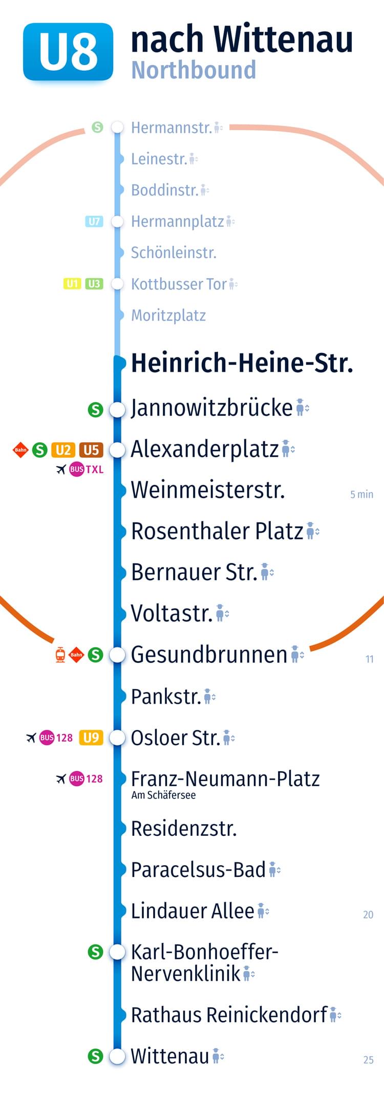
Above all else, it is easy to scale out the map to other formats; it can really serve as a base for a good navigation system.
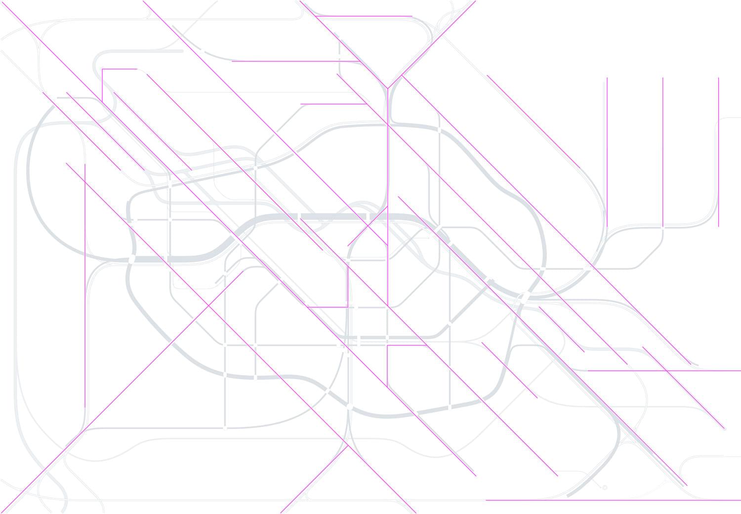
Single line map

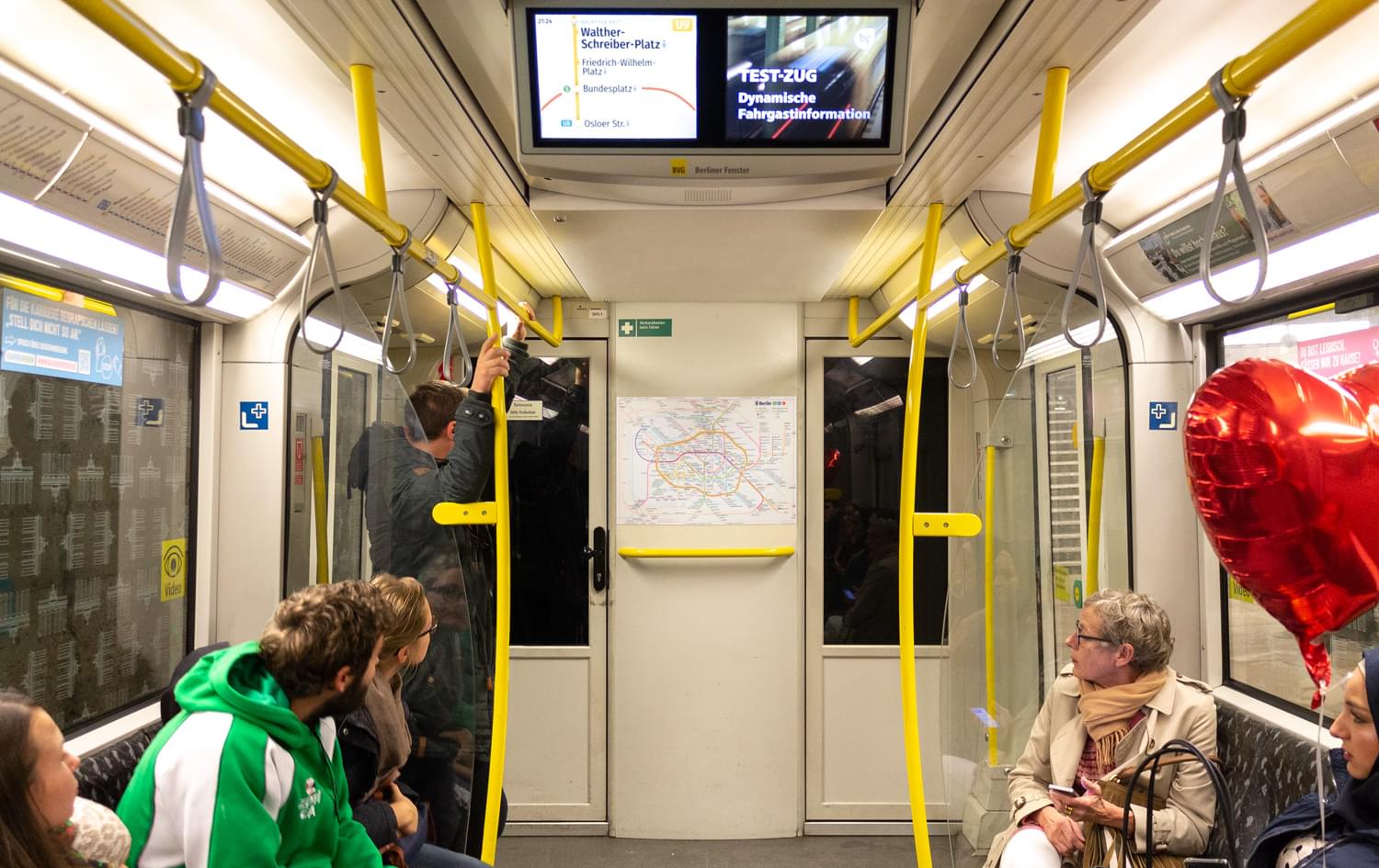
Video display
Vertical list of stations
Q&A
What about Henry Beck Principles? Why are the Line Drawings Different from the London Pattern?
The map uses Beck’s principles: the lines are drawn at 45-degree grade grid, at the same time the angle roundness radius is larger. Only circular line has a free geometry shape.
Besides, the map is, primarily, a tool that helps people to get their directions and build a route, not a notional standard drawing. The map may look as one chooses given it can solve its task in the best way possible. London Tube map design works well in London, but it does not mean it can work well anywhere.
Is it an Official Map?
Not yet. First, we need to know if people like it. Download, print, and use the map, share the information about it with your friends, write posts on the social media—then it will become an official one.
How can I use it?
Free of charge for non-commercial purposes, for commercial ones-as agreed. The map is not subject to any changes. A source link berlintransitmap.de should be placed beside the map.
How can I share my opinion about the map?
Write a post on the social media with #berlintransitmap hashtag, or write to mail@berlintransitmap.de
Project by Paul Lefrank · 2018–2026